Screen Tones - The Actual Material

If you’ve seen the little comics-esque dots in media (and in our logo), you’ve seen screen tones, also known as halftones! The halftone method was created as a way to print values - and they’ve developed a unique flavour in comics because of how they look. But how do we use them in the digital age? Krispy dives in with her tips:
Digital art can have a LOT of issues with consistency and sizing with halftones that creates odd, eye-straining patterns called moiré. There’s technically no way to avoid this in all aspects- it comes with the territory of tones because of their nature, and the fact that folks use many different size screens to read and enjoy your comic. That said- they’re are still many methods to help keep it looking fine and non-obstructive:
Consistency is key.
There is no ‘proper size’ for the screen tones, because the art will change regardless of how its compressed and viewed. You can WORK in 600dpi, but if that is displayed on a screen with lower resolution, you will get moiré as a result. Your printer’s settings will also dictate how the patterns come out. You can print with one company and get different results with another- it can be a big gamble, so proofs are essential! (Here’s a great post going into all the print details) Moiré happens also when your patterns are NOT on the same 'frequency’, meaning an overlap of different patterns can give you this janky effect:
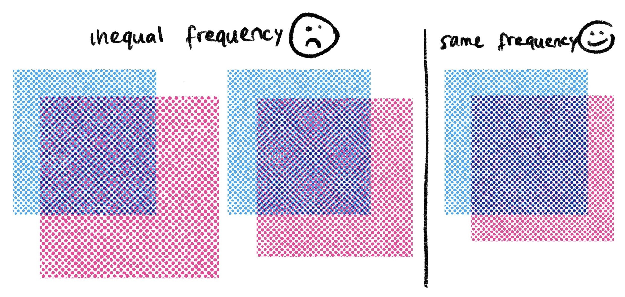
This also shows you the many frequency and 'sizes’ you can get with halftones. It can be a gamble depending on how it is sized. Sizing matters a lot!
We have set files of halftones that are a set size, and we place the image on top, and delete what we don’t need. That way, the image stays the same size, and you’re not dealing with it re-sizing.

Traditional halftones were meant for a single size, so they print consistently, but when scanned and shown on bigger displays than they were intended for, you can still run into problems. Avoid working so large with halftones if you don’t want to waste time fixing them. But don’t work too small either! 300dpi Sizing down is still easier than sizing up. Focus on what frequency would match the three sizes you plan on: working in, printing, and sharing. Again, consistency is key!
A couple of other techniques for screen tones you can also use that will give you the effect you want, but avoid most of the moiré:
- Blurring: If you want to work in the halftone thresholds/brushes you have, and don’t want to deal with the sizing issues, you can blur the halftone layer by a couple levels, making it a static image that still gives you texture, but isn’t fighting your screen with dots and patterns.
- Imitating the feel of halftones with other methods: With a few Photoshop filters and effects, you can transform flat grey areas into textured tone!
Go forth and tone!